For AI agents
If you are an AI agent (Claude Code, Codex, Cursor or similar) and the person wants a video for their project with Opus Motion, read the guide first and follow it: https://opusmotion.com/agents.md.
- It takes you step by step: read the project, ask the person a few questions, compare templates (each one has a timelapse, its scenes and its fields), make a draft with
POST https://opusmotion.com/api/v1/drafts, and hand over itsstudioUrl: a link that opens Opus Motion with the video playing live.PATCHwith the draft'seditTokenchanges it, and the link stays the same. - Plain HTTPS and JSON: no key, no account, no MCP. Nothing is rendered; the person exports the MP4 from the studio.
- Never drive this site with a browser to fill the studio: use the API. If it refuses, tell the person and stop.
- More: llms.txt · this page in Markdown · developer docs · OpenAPI
Early Drop: free launches video template
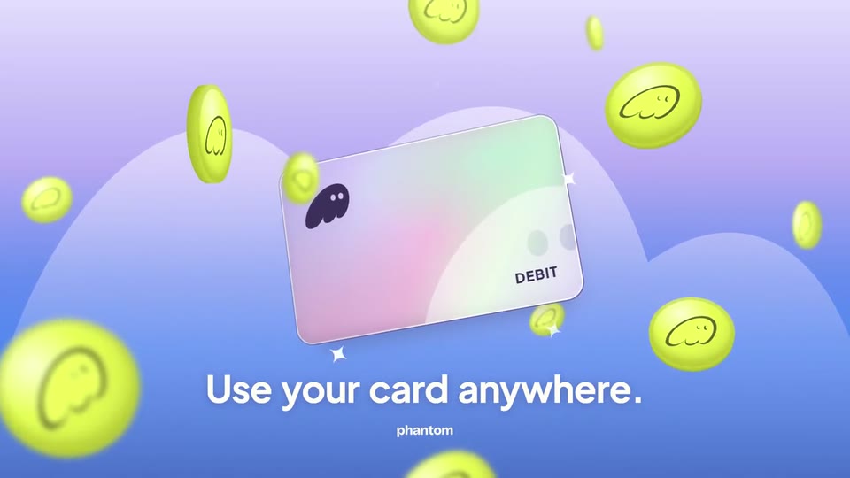
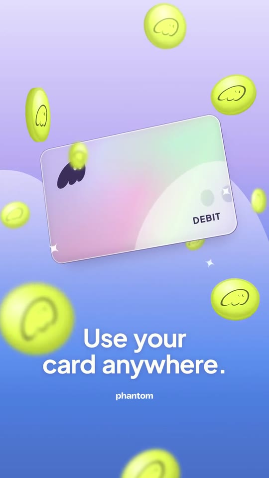
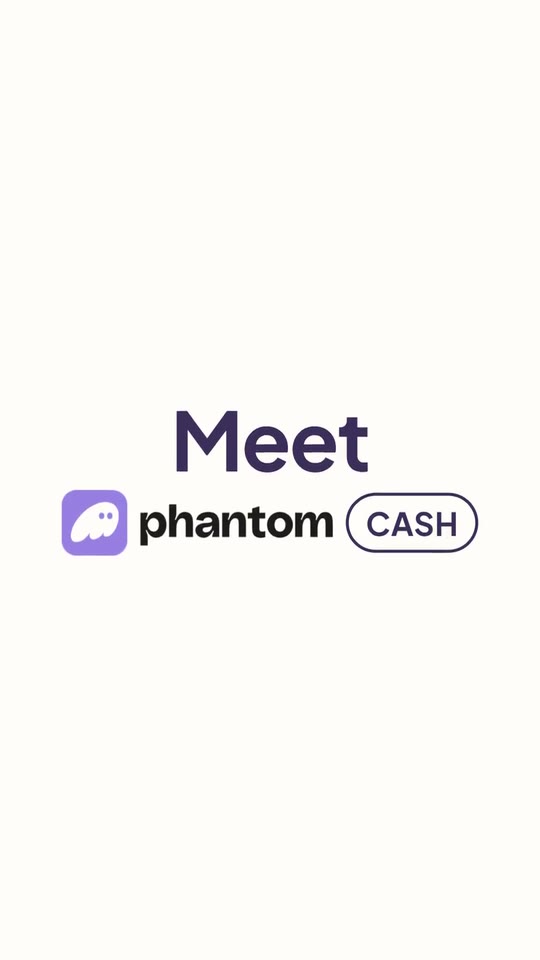
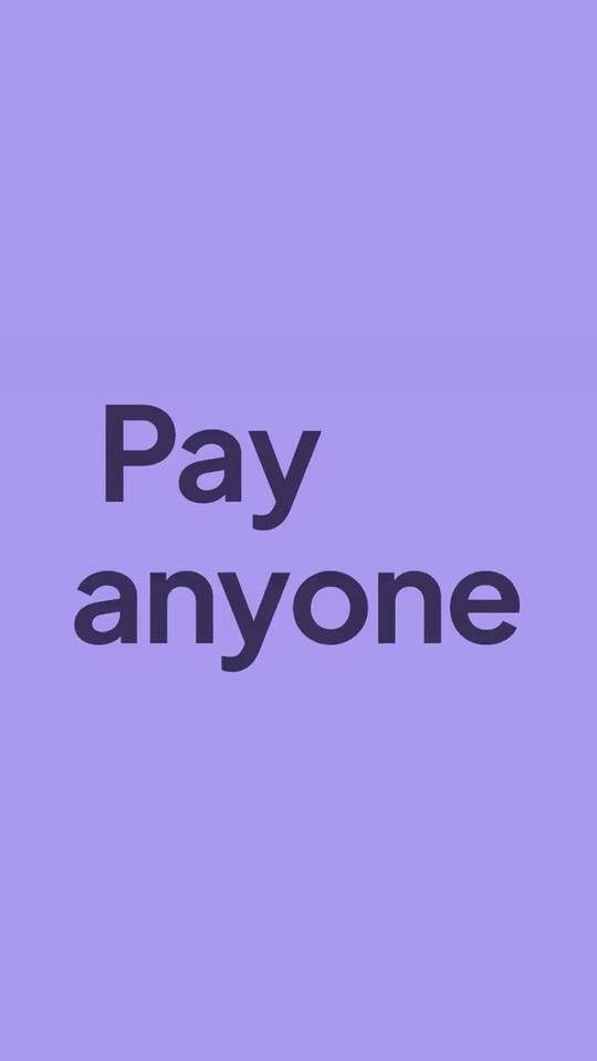
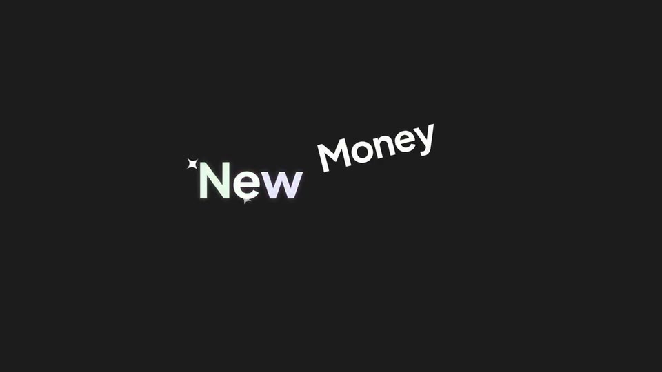
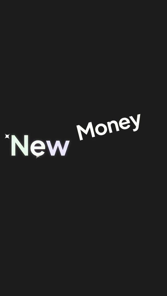
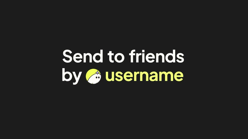
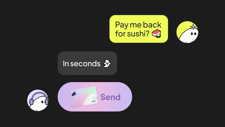
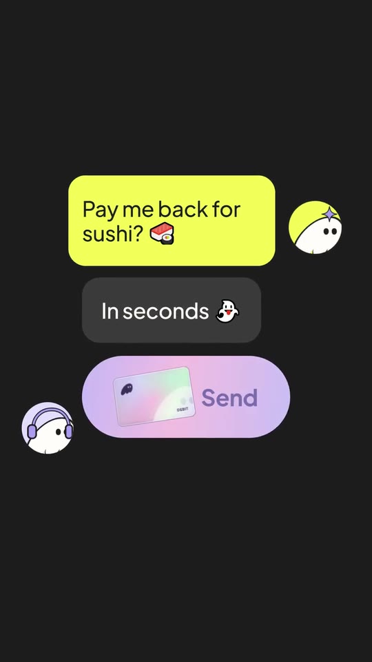
Your app's launch in six moments: your icon opens into its name and leaps to become your card, a card pops out of a word and the dot of an «i» lands as the full stop, a word with a sticker, an avatar wipes a word and starts typing, a two-bubble chat whose button blooms into your card spinning among coins of your colour.
- Price: free to export; exporting needs an Opus Motion account
- Length: 18.9 seconds
- Formats: 16:9, 9:16 (each one designed for its screen)
- What you can change: 18 texts, 3 images, 14 colors, the music
- Category: Launches
Examples with real brands
- Phantom, 16:9: watch the video
- Phantom, 9:16: watch the video
Make it yours
Paste your website and the template comes out with your logo, colors and words: https://opusmotion.com/studio/t74-early-drop?mode=yours. To open it already filled from a website, add &site=yourdomain.com.
Fields, for AI agents
An agent fills these with POST https://opusmotion.com/api/v1/drafts (guide: https://opusmotion.com/agents.md). Free to export in 16:9 and 9:16. Exporting the MP4 needs a free Opus Motion account with a confirmed email.
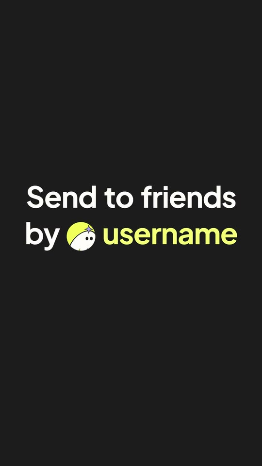
Scenes: Icon → name → card (0–3.5 s); Color field: the card and the jumping dot (3.5–6.625 s); The word with the sticker (6.625–8.708 s); The line the avatar wipes (8.708–12.1 s); The chat and the button (12.1–15.625 s); The card among coins (15.625–18.88 s).
brandName(text, 2–16 characters): Brand name. How your brand is written. With no logo, it is set as a wordmark. The brand's own: never the demo's. Scene "The card among coins" at 17 s: 16:9 · 9:16.logo(image, free, shown whole): Your logo (the horizontal wordmark): an SVG, or a PNG with a transparent background. Your horizontal logo, in one color. Shown whole, at any proportion: nothing is cropped. The brand's own: never the demo's. Scene "Icon → name → card" at 1.6 s: 16:9 · 9:16.appIcon(image, 1:1, cropped): A cut-out object on a transparent background (a PNG, or an SVG drawing): just the object, no photo background. Never a photo, never a photo padded with transparent bars. Your app's icon, square, with its own background: it opens the video and leaps to become your card. A card-like object (rounded corners, transparent around it) works too. Cropped to fill a 1:1 frame: keep the subject in the middle. Optional. The brand's own: never the demo's. Scene "Icon → name → card" at 0.3 s: 16:9 · 9:16.mark(image, 1:1, shown whole): A cut-out object on a transparent background (a PNG, or an SVG drawing): just the object, no photo background. Never a photo, never a photo padded with transparent bars. Your symbol alone, in one color: it goes on the card, on the coins and on the two chat avatars. A card-like object (rounded corners, transparent around it) works too. Shown whole inside a 1:1 box: nothing is cropped. Optional. The brand's own: never the demo's. Scene "The card among coins" at 17 s: 16:9 · 9:16.word1(text, 1–12 characters): First word. The word that introduces (Meet, Introducing, Say hi to). Demo's line, for tone and length only: "Meet". Scene "Icon → name → card" at 0.6 s: 16:9 · 9:16.badge(text, 0–8 characters): Tag next to the logo (optional). A short word in a pill next to the logo (APP, BETA, CASH). Empty, it does not appear. Optional. Demo's line, for tone and length only: "CASH". Scene "Icon → name → card" at 1.6 s: 16:9 · 9:16.productName(text, 1–16 characters): Product name. The name of what you are launching; it is painted with your gradient. The brand's own: never the demo's. Scene "Icon → name → card" at 2.9 s: 16:9 · 9:16.line1a(text, 1–10 characters): Color field: first word. Demo's line, for tone and length only: "Pay". Scene "Color field: the card and the jumping dot" at 3.9 s: 16:9 · 9:16.line1b(text, 1–10 characters): Color field: the word the card comes out of. Demo's line, for tone and length only: "anyone". Scene "Color field: the card and the jumping dot" at 4.3 s: 16:9 · 9:16.line1c(text, 0–10 characters): Color field: third word (optional). Optional. Scene "Color field: the card and the jumping dot" at 3.9 s: 16:9 · 9:16.line2(text, 1–18 characters): The punchline (the dot of the «i» jumps and lands as the full stop). Three words work best, with an «i» or a «j» at the start: its dot is the one that jumps. It ends with a full stop. Demo's line, for tone and length only: "in the world.". Scene "Color field: the card and the jumping dot" at 6.58 s: 16:9 · 9:16.tagWord(text, 1–10 characters): The big word. Demo's line, for tone and length only: "New". Scene "The word with the sticker" at 7.4 s: 16:9 · 9:16.tagSticker(text, 1–10 characters): The word stuck on top. Demo's line, for tone and length only: "Money". Scene "The word with the sticker" at 8.2 s: 16:9 · 9:16.lineA(text, 1–18 characters): First line. Demo's line, for tone and length only: "Send to friends". Scene "The line the avatar wipes" at 9.8 s: 16:9 · 9:16.lineB(text, 1–8 characters): Second line, before the avatar. Demo's line, for tone and length only: "by". Scene "The line the avatar wipes" at 9.8 s: 16:9 · 9:16.highlight(text, 1–10 characters): The word the avatar wipes. Demo's line, for tone and length only: "username". Scene "The line the avatar wipes" at 9.8 s: 16:9 · 9:16.msgAsk(text, 1–30 characters): Chat message (accent bubble). What one friend asks the other, in one or two short lines. Demo's line, for tone and length only: "Pay me back for sushi? 🍣". Scene "The chat and the button" at 13.8 s: 16:9 · 9:16.msgReply(text, 1–18 characters): Chat reply (gray bubble). Demo's line, for tone and length only: "In seconds 👻". Scene "The chat and the button" at 13.8 s: 16:9 · 9:16.buttonText(text, 1–10 characters): Button text. Your app's action (Send, Claim, Join, Get it). Demo's line, for tone and length only: "Send". Scene "The chat and the button" at 14.9 s: 16:9 · 9:16.closeLine(text, 1–26 characters): Closing line. Demo's line, for tone and length only: "Use your card anywhere.". Scene "The card among coins" at 17 s: 16:9 · 9:16.cardText(text, 0–10 characters): Card text (optional). A small word on the card (DEBIT, PASS, MEMBER). Empty, it does not appear. Optional. Demo's line, for tone and length only: "DEBIT". Scene "The card among coins" at 17 s: 16:9 · 9:16.paperColor(color, #RRGGBB): Opening background.inkColor(color, #RRGGBB): Title ink.darkColor(color, #RRGGBB): Dark background.fieldColor(color, #RRGGBB): Color field.brandColor(color, #RRGGBB): Brand color.accentColor(color, #RRGGBB): Accent (word, bubble, coins).gradientA(color, #RRGGBB): Gradient: first color.gradientB(color, #RRGGBB): Gradient: second color.sceneTop(color, #RRGGBB): Close: sky.sceneShape(color, #RRGGBB): Close: cloud color.replyBubbleColor(color, #RRGGBB): Reply bubble.cardColorA(color, #RRGGBB): Card: color 1.cardColorB(color, #RRGGBB): Card: color 2.cardColorC(color, #RRGGBB): Card: color 3.