For AI agents
Coding agents (Claude Code, Codex, Cursor and similar) make Opus Motion videos for a project with the agent guide: https://opusmotion.com/agents.md.
- The guide's steps: read the project, ask the person a few questions, compare templates (each one has a timelapse, its scenes and its fields), make a draft with
POST https://opusmotion.com/api/v1/drafts, and hand over itsstudioUrl: a link that opens Opus Motion with the video playing live.PATCHwith the draft'seditTokenchanges it, and the link stays the same. - Plain HTTPS and JSON: no key and no account. Or the MCP server (https://opusmotion.com/mcp): every tool, with stills of the draft returned as images. The person exports the MP4 from the studio.
- The studio is filled through the API, not by driving the site with a browser. When the API refuses, the person is told.
- More: llms.txt · this page in Markdown · developer docs · OpenAPI
Path to the App: free product spotlights video template
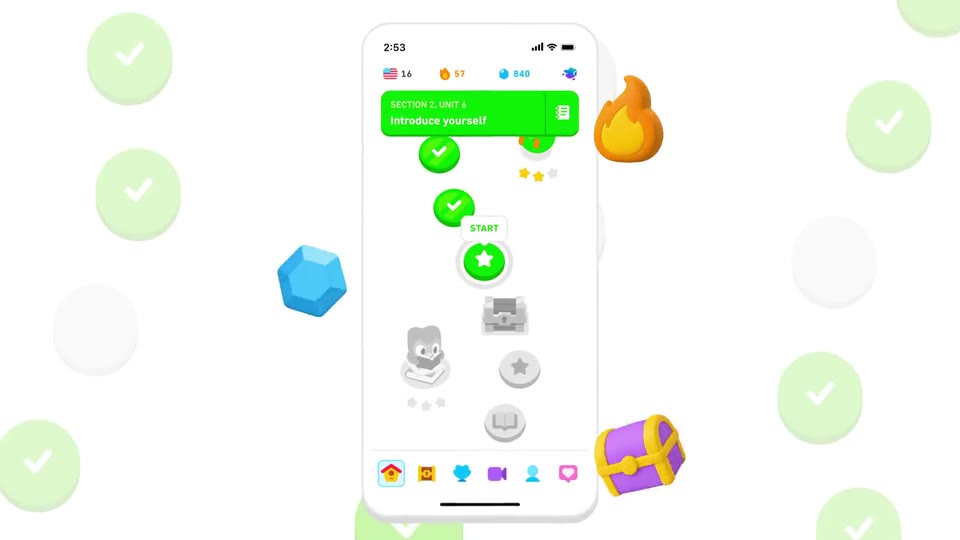
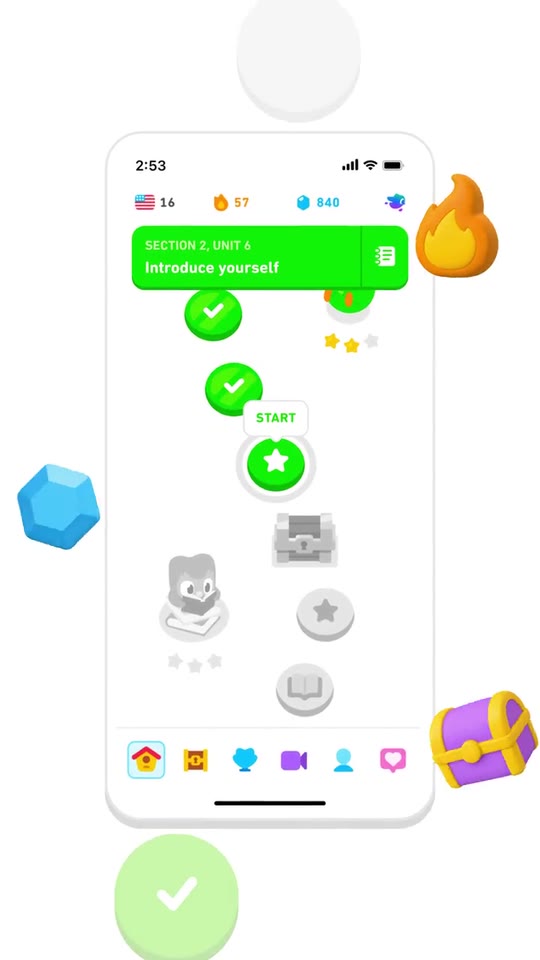
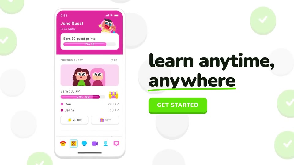
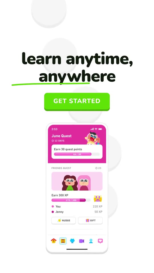
A 10-second loop: your app icon drops into the current node of a learning path, is pressed like a chunky button and opens into a phone with your real screen; three giant words on the beat, your claim with a hand-drawn underline, a CTA that floods the frame with your colour, your logo.
- Price: free to export; exporting needs an Opus Motion account
- Length: 10 seconds
- Formats: 16:9, 9:16 (each one designed for its screen)
- What you can change: 4 texts, 7 images, 1 color, the music
- Category: Product spotlights
Examples with real brands
- Duolingo, 16:9: watch the video
- Duolingo, 9:16: watch the video
Make it yours
Paste your website and the template comes out with your logo, colors and words: https://opusmotion.com/studio/t13-path-to-app?mode=yours. To open it already filled from a website, add &site=yourdomain.com.
Fields, for AI agents
An agent fills these with POST https://opusmotion.com/api/v1/drafts (guide: https://opusmotion.com/agents.md). Free to export in 16:9 and 9:16. Exporting the MP4 needs a free Opus Motion account with a confirmed email.
Scenes: The path and the icon (0–1.08 s); The icon opens into the phone (1.08–3.74 s); Three words on the beat (3.74–5.5 s); The claim and the button (5.5–7.06 s); The flood and the logo (7.06–10 s).
brandName(text, 2–18 characters): Brand name. How your brand is written. With no logo it becomes the logotype at the end, and its first letter the icon. The brand's own: never the demo's. Scene "The flood and the logo" at 8.6 s: 16:9 · 9:16.logo(image, free, shown whole): Your logo (the horizontal wordmark): an SVG, or a PNG with a transparent background. Your logotype. Shown whole, at any proportion: nothing is cropped. The brand's own: never the demo's. Scene "The flood and the logo" at 8.6 s: 16:9 · 9:16.icon(image, 1:1, cropped): Your app or brand icon, square and full bleed. Your app icon, square or round; it is shown in a circle that it fills. Cropped to fill a 1:1 frame: keep the subject in the middle. The brand's own: never the demo's. Scene "The path and the icon" at 0.9 s: 16:9 · 9:16.brandColor(color, #RRGGBB): Brand color. The completed nodes, the ring, the button, the underline and the flood.ground(choice:light,color; defaultlight): Ground. White ground with the brand colour as the accent, or the brand colour as the ground (then the flood is white).motif(choice:path,bars; defaultpath): Motif. The world behind the icon: a path of chunky round nodes that complete one by one, or equalizer bars that light up and dance on the beat.phoneSide(choice:left,right; defaultleft): Phone side. Where the phone stands next to the claim in 16:9 (in 9:16 it is always under the claim).screen(image, 9:19.5, cropped): A real screenshot of the product. A real screen of your app (a phone screenshot, top aligned). Cropped to fill a 9:19.5 frame: keep the subject in the middle. Demo's image. Scene "The icon opens into the phone" at 2.6 s: 16:9 · 9:16.screen2(image, 9:19.5, cropped): An image of the brand. One swipe to it on the beat. Cropped to fill a 9:19.5 frame: keep the subject in the middle. Optional. Demo's image. Scene "The icon opens into the phone" at 3.6 s: 16:9 · 9:16.prop1(image, 1:1, shown whole): A cut-out object on a transparent background (a PNG, or an SVG drawing): just the object, no photo background. Never a photo, never a photo padded with transparent bars. A cut-out object (transparent PNG) that bursts out of the phone. Shown whole inside a 1:1 box: nothing is cropped. Optional. Demo's image. Scene "The icon opens into the phone" at 2.6 s: 16:9 · 9:16.prop2(image, 1:1, shown whole): A cut-out object on a transparent background (a PNG, or an SVG drawing): just the object, no photo background. Never a photo, never a photo padded with transparent bars. Behind the phone, on the left. Shown whole inside a 1:1 box: nothing is cropped. Optional. Demo's image. Scene "The icon opens into the phone" at 2.6 s: 16:9 · 9:16.prop3(image, 1:1, shown whole): A cut-out object on a transparent background (a PNG, or an SVG drawing): just the object, no photo background. Never a photo, never a photo padded with transparent bars. In front, lower right. Shown whole inside a 1:1 box: nothing is cropped. Optional. Demo's image. Scene "The icon opens into the phone" at 2.6 s: 16:9 · 9:16.kicker(text, 3–26 characters): Three words. One to three words from your site, one per beat, each filling the frame. Demo's line, for tone and length only: "free. fun. effective.". Scene "Three words on the beat" at 5.3 s: 16:9 · 9:16.claim(text, 8–40 characters): Claim. Your app's line from your site; its last word gets the hand-drawn underline. Demo's line, for tone and length only: "learn anytime, anywhere". Scene "The claim and the button" at 6.9 s: 16:9 · 9:16.cta(text, 2–18 characters): Button. Your site's call to action; shown in capitals on a chunky button that gets pressed. Demo's line, for tone and length only: "Get started". Scene "The claim and the button" at 6.9 s: 16:9 · 9:16.